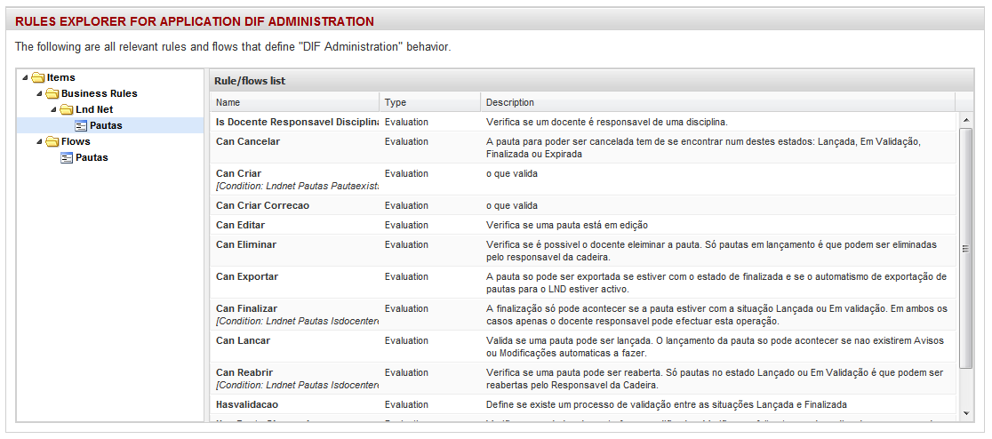
Description: A multiSelect component is an integration of a grid component with a Tree for filtering purposes.
This component represents an extension of the Grid component, adding the tree and linking the selection action of a Tree item with the refresh of the grid component with the selected element for filtering.
JavaDoc: Click here
Remarks: This encloses basically a Grid and a Tree components. It can also integrate with a form component, like the Grid also does.
Body content: JSP context.
Attributes:
| Name | Description | Data type | Required | Default value |
| id | The name (identifier) of the grid. | String | Yes | - |
| title | The title for the grid. | String | No | - |
| treeTitle | The title for the tree panel. | String | No | - |
| treeItems | The item list | ListTreeItemDefinition | No | Inner TreeItem components |
| autoNumberPrefix | Auto-inserts numbered prefixes to each tree item (taking into account subItem numbering. | Boolean | No | False |
| height | Tree height (with scroll if larger). | Integer | No | auto |
| treeWidth | Tree width. | String | No | 33% |
| data | The method that provides the data for the grid. | Map<Object> | No | - |
| ajaxEvent | An AJAX event to load the data for the grid. In the form "eventID" or "stageID:eventID". | String | No | - |
| serversort | Perform sorting on the server side. Only with "ajaxEvent". | Boolean | No | Always true if recordsperpage is used |
| noDataMessage | Message to show when there are no rows to show. | String | No | - |
| recordsperpage | The number of records in each page. Can only be used with "ajaxEvent". | Number | No | - |
| plainHtml | Forces HTML table even in rich mode | Boolean | No | False |
| multiSelect | Activates multi-select for rows. IN DEVELOPMENT!!! | Boolean | No | False |
| readonly | Allows editing of the grid. | Boolean | No | False |
| readonlyColumn | Defines the column to dictate conditional row editing. | String | No | - |
| addForm | Adds the generation of a dynamic form for new row. IN DEVELOPMENT!!! | Boolean | No | False |
| addInline | Adds a add row with in-line grid editing of the new row fields. IN DEVELOPMENT!!! | Boolean | No | False |
| editForm | Replaces the "edit in-line" of the grid with an edit form with all fields. IN DEVELOPMENT!!! | Boolean | No | False |
| delRow | Adds a delete icon functionality. | Boolean | No | False |
| groupColumn | The column to use as a group column. | String | No | - |
| renderFootnotes | Defines if footnotes are rendered on the element. | Boolean | No | True |
Important: All stages must add a "selectedItem" parameter to read the selected tree item and apply to the grid data filter. This parameter name is not customizable.
Examples:
View - JSP file
<dif:document>
    <dif:gridTreeSelect id="rules" treeItems="${stage.items}" treeWidth="20%" ajaxEvent="list"
                        title="${messages.gridTitle}">
        <dif:column attribute="name" width="50" />
        <dif:column attribute="type" width="30" />
        <dif:column attribute="description" width="140" wordWrap="true" />
    </dif:gridTreeSelect>
</dif:document>
Stage - Class file
public class SomeStage {

    (...)

    @Parameter
    String selectedItem;

    @OnAJAX("list")
    public IJSONResponse getItemList()
    {
        JSONResponseGrid response = new JSONResponseGrid(context);
        String[] fields = {"name", "description", "type"};

        List<SomeBean> records = new ArrayList<SomeBean>();
        (...)
        response.setRecords(records, "name", fields);

        return response;
    }

    /**
     * @return the list of rules and flows points for the current application
     */
    public List<TreeItemDefinition> getItems()
    {
        List<TreeItemDefinition> items = new ArrayList<TreeItemDefinition>();
        (...)
        return items;
    }
}

See also: